Manychat Foundation, Components, and Docs
Manychat Foundation, Components, and Docs
| Company | Manychat |
| Industry | SaaS, Conversational Marketing |
| Year | 2024 – 2025 |
| Role | Design System Architect & Hands-on Engineering Manager |
| Team | Bridge the Gap (my consultancy team) — three engineers including me — partnering with Manychat's design-system tech lead, in-house design-system designer, and a second in-house lead engineer who joined mid-engagement |
| Stack | Figma, React, TypeScript, CSS Modules, Storybook (6.5 → 8.x), Vite, semantic-release |
My role
I joined as design-system architect and hands-on engineering manager. I led the Bridge the Gap engineers and wrote a large part of the library myself. Manychat's design-system tech lead chaired the cadence and held architectural authority on their side. I brought the architecture, the spec-driven method, and the day-to-day engineering management. Specs were written and walked through with the designer and the tech lead before any code, so design and development moved together.
The system lives in the product repository, and the UI is data-heavy: tables, lists, and the long forms behind every flow. I worked with a design organisation of about 10 to 20 designers. Adoption into product code was part of my job. Documentation stayed in Markdown inside that repo, so engineers — and later agents — could read it where the code already lived. I used Copilot in the delivery. I also built a proof of concept, not shipped into production, for AI-assisted adoption: past product changes taken from Git history, so a later agent can retrieve how a migration was done instead of exploring the codebase from scratch.
Happy to go further than this page. The screens, the trade-offs, and how the work landed in the product are easier to show in a private conversation — get in touch if you'd like that.
Executive summary
Manychat (a conversational-marketing platform used by over a million businesses) was outgrowing its in-house React component library. The product surfaces are data-heavy: automation flows, subscriber lists, broadcast dashboards, audience filters, analytics views, and the long forms behind every flow node. The component library had to hold up at that density — and the system underneath was uneven: gaps in the form family, an aging Storybook setup, and a foundations layer that designers and developers consulted in different mental models. The team didn't lack skill; they lacked the capacity to invest in foundations while still serving a fast-moving product roadmap.
For seventeen months, Bridge the Gap (my consultancy team) partnered with Manychat's in-house design-system folks. As the design-system architect on our side, I led the technical and documentation direction across components, accessibility, Storybook, and the foundation pages designers and engineers actually use. Together with my team, we shipped 25+ new components, rewrote the form scaffolding, modernised Storybook through three major versions, and rebuilt the surfaces: sidebar tags, custom Docs grid, props categories, token pages.
The end result: a design system that product teams reach for first, that catches accessibility issues at compile time, and that designers and engineers navigate from the same surface.
Context — what we walked into
Manychat's component library, @manychat/manyui, had grown organically over years. It worked, but a closer audit surfaced four recurring patterns:
- Inconsistent form components. Text inputs, number inputs, search, and textarea each implemented their own label / help-text / error layout. Changing one piece of behaviour meant tracking it through five places.
- Accessibility relied on convention. A form input could ship without a label or
aria-label. Lint rules caught some cases; the rest depended on review. - Documentation that didn't help designers. Tokens were listed, but the link from "this colour" to "this CSS variable" or "this utility class" was ambient knowledge, not on the page.
- Component handoff stopped at the library boundary. New components landed in
manyui, but adopting them inside the product was treated as a product-team problem. Adoption stalled.
These weren't crises — they were the friction points that slow down a healthy product team. Manychat's leadership asked us to take ownership of the foundation so their team could keep shipping features.
How we worked
Spec-driven definition before code
I work with a method I call ultra-defined components — closely related to spec-driven development, but with a stronger emphasis on the human side of the conversation.
Before a single line of component code is written, I produce a written spec that lists everything the component does: the interface, accessibility behaviour, edge cases, and a natural-language test plan ("the popover closes when Escape is pressed"). The spec is then walked through together — designer, tech lead, and developers — until the disagreements surface and resolve upfront.
Two things make this method work:
- The spec is written for humans first. A designer who never reads TypeScript can argue with a sentence like "the popover anchors to its trigger and avoids the viewport edge." They cannot argue with a type signature. So the discussion stays where the disagreements actually live: behaviour, not syntax.
- The test plan precedes implementation. Once the spec is signed off, the test list often becomes the test file almost verbatim. The component itself is then frequently a no-op for the developer — sometimes Copilot finishes it on the first try.
I wrote up the method publicly on the Bridge the Gap blog: Define your rock-solid design system components. Manychat was the engagement where I refined it most.
Research with the designer
A spec doesn't appear from nowhere. The research that fed each one was a partnership with the in-house design-system designer.
The conversation usually opened with the designer sharing their initial thinking — not a finished proposal, but the product-context view: where the friction was, what shape a solution might take, what feeling they wanted to land. From there I'd take the topic into industry research, studying how other design systems have already solved adjacent problems. A lot of the strongest systems are open-source, which lets me look past the marketing surface at what the team actually decided:
- Source code — which props they expose, where their abstractions live, which edge cases their code admits.
- Live DOM, CSS, and focus behaviour — how the rendered component actually behaves under interaction, especially the keyboard and screen-reader paths that don't show up in screenshots.
- Public Storybook, Figma libraries, and docs sites — how variants are organised, which naming patterns the field has converged on.
- GitHub issues, RFCs, changelogs — the design rationale visible in past discussions; what the team has learned the hard way.
Reverse-engineering is the part that takes craft. Public docs say what a component does; they rarely say why it ended up like this. So I inspect the artefact directly and try to reconstruct the decisions — why this prop and not that one, why focus moves this way on Escape but not on Tab. Sometimes another team was solving for the same constraints we had, and we'd adopt the pattern. Often they were solving for different constraints, and the act of articulating what was different about Manychat became the design decision in itself.
I'd bring the research back to the designer alongside the technical constraints I'd surfaced from Manychat's own product codebase — which existing patterns we'd have to live with, what each option would actually cost. The designer's proposal followed from there: grounded in product reality, in a wider sense of what's possible across the field, and in the constraints of the system we were extending.
That rhythm — designer's initial framing → industry-and-codebase research → designer's informed proposal → joint spec — was the working loop. It ran several dozen times across the engagement. Slower than "design first, build second", but it almost never produced a component we wanted to redesign three months later.
Embedded, not handed-off
We worked as one team. Bridge the Gap brought three engineers including me; on the Manychat side we partnered closely with the in-house design-system tech lead, the in-house design-system designer who owned the Figma side, and (from mid-engagement) a second in-house lead engineer. A weekly sync chaired by Manychat's tech lead held the cadence; quarterly roadmap reviews kept the bigger arc in focus.
The collaboration with Manychat's in-house designer was where most component decisions started. They drove the visual and Figma side and were the bridge to the broader product-design organisation — translating wider designer feedback to us and representing our work back to the design org. We also spent time together on running a design system as a discipline: governance, contribution flow, communication patterns. That conversation was mutual — they brought the design-org context that made any practice fit; I brought patterns I'd seen work on other engagements.
A week in Barcelona. Mid-engagement, the whole team — Bridge the Gap consultants and Manychat's design-system stakeholders — met in person in Barcelona for a week. Tighter alignment on the V1→V2 migration, a shared mental model of which components were next, and the human glue that makes tough feedback easier to give and receive.
Distributed ownership
The design system is Manychat's, owned in-house by people whose roles are dedicated to it. The in-house designer holds the visual language and the link to the broader product-design organisation. The in-house tech lead holds architectural authority on the Manychat side. A second in-house lead engineer joined mid-engagement and broadened the in-house engineering bandwidth on day-to-day system work.
Bridge the Gap added extra capacity and patterns we'd seen work elsewhere; the in-house team brought the deep product, organisational, and customer context that made any pattern actually fit. Both contributions were load-bearing. Specs were co-authored: every spec-driven definition session was a joint conversation, not a hand-off.
The system has multiple competent owners inside Manychat. That's the design.
Component lifecycle
The catalogue isn't a static set — it's a system that has to grow with the product, accept new patterns from product teams, and retire components that no longer fit. We codified four explicit lifecycle stages so the system's own state is visible to everyone consuming it, in the sidebar and on every component's docs page.
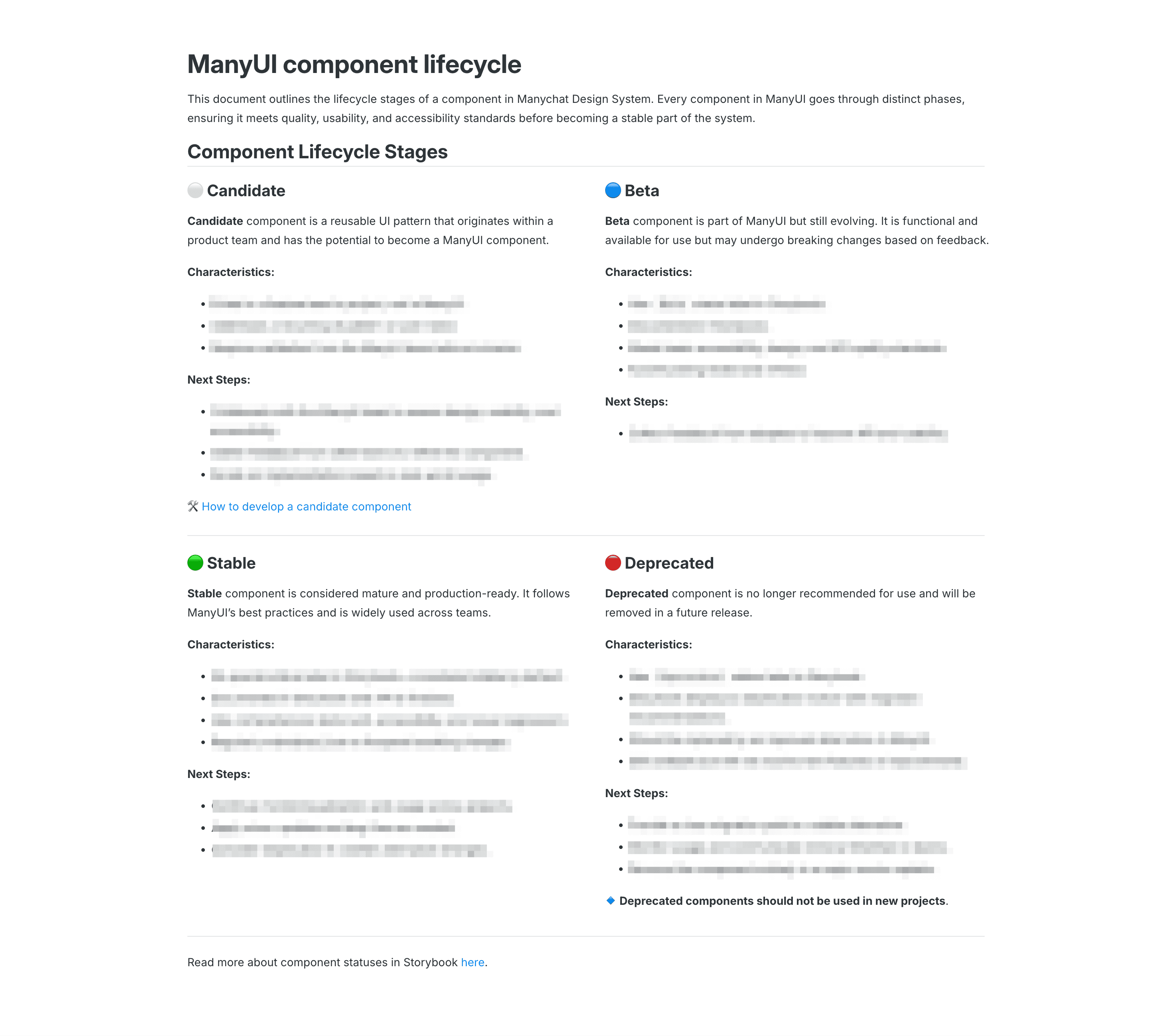
The stages map a clear renewal flow:
- ⚪ Candidate. A reusable UI pattern that emerges in a product team's code and could become part of
manyui. The catalogue door is open: anything recurring across surfaces is a Candidate. The DS team validates design, accessibility, and API shape before promotion — so new components arrive with usage evidence, not from guesses. - 🔵 Beta. A component that has shipped into
manyuibut is still evolving. It carries a Beta tag in the sidebar, has working Storybook docs, and meets the baseline accessibility / design / API standards — but its surface may still change. Adopters know what they're signing up for; the team can iterate publicly without freezing the catalogue. - 🟢 Stable. Production-ready. No special label in the sidebar — Stable is the default. Comprehensive tests (unit, accessibility, visual regression) pin the behaviour; only minor updates and bug fixes from here. This is the contract product teams rely on.
- 🔴 Deprecated. Marked with a Deprecated tag and a notice on the docs page that points to the replacement. The component still works but stops getting new features. A clear migration path is published; the component is removed in a future major version.
The renewal pattern is the point. Every component flows through these four stages, in the open. New patterns can enter from product teams; mature ones earn the unlabelled "Stable" default; replaced ones leave on a schedule with a migration path. Nothing rots in place; nothing freezes; nothing surprises product teams. The lifecycle is visible governance — surfaced as sidebar status tags so any engineer can read the catalogue's health at a glance, without consulting a separate document.
Adoption is part of the design system team's job
We treated migrating product code onto new components as our work, not the product team's. When CheckboxV2 was ready, we rolled it out. When a legacy SystemMessage was replaced by a new SectionMessage, we updated the consumers in the same week. By the end of the engagement, ~1,500 product file-touches sit on the design-system team's commits.
This is a different operating model from "publish the library and consult." It's slower in raw component-throughput, but it dramatically tightens the feedback loop between what we built and whether it actually fits the product. Several mid-course corrections came directly from migration friction we hit ourselves.
Signature work
A form family that composes
The biggest architectural undertaking was the form scaffolding. Behind every text input, number input, search field, autocomplete, and textarea now sits a single shared layout component, FormTextField, that owns label / help-text / error-message rendering. Choice-style controls (Checkbox, Radio, Toggle) sit on a parallel FormChoiceField. Help-text styling, error positioning, and label association each live in one place.
I designed and implemented the shared layout. The work was instrumented with explicit tests for the failure modes we needed to be sure of — ref forwarding to the underlying input, layout composition under unusual prop combinations, label association with the input on click. Those tests now run on every PR that touches a form component.
The architectural payoff for designers: changing the way help text renders across the form family is a one-day job, not a five-component sweep. New form-style components inherit the layout behaviour by composition.
Accessibility lifted into the type system
A form input at Manychat now cannot compile without at least one of label, ariaLabel, or ariaLabelledBy. The labelling rule is enforced through the TypeScript type system itself — a small change in the codebase, an outsized effect on the product. The week we landed it, 30+ product files changed in a single PR — every existing form input that hadn't been declaring its labelling now had to. "An input without a label" stopped being a review item and became a build error.
Pairing the type-system rule with our test convention (queries by ARIA role, not test-id) means an inaccessible input fails twice — at compile time and in tests.
A custom grid for the Storybook docs
Designers and product engineers don't browse Storybook the way design-system engineers do. They want to see all the variants of a component on one page — not a single canvas with a switcher. We built a custom Docs layout that arranges stories in a compact grid, applied once at the global Storybook level so every component (and every component added in the future) inherits it for free.
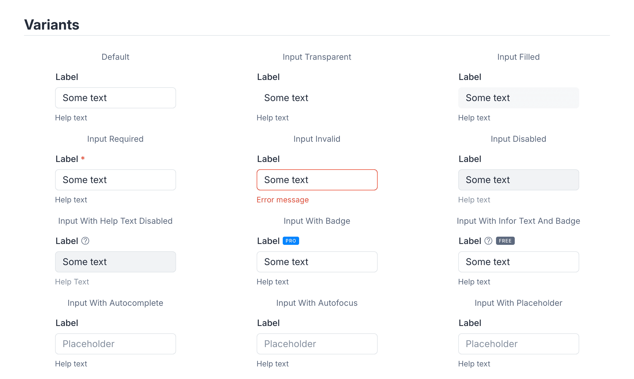
The change is small in code, but it shifts how the system gets read. A design reviewer scanning a PR can take in twelve states of a button at a glance. A product engineer checking which size of Card to pick sees the whole family at once. Storybook went from "click into each story" to "scan a page".
Status tags in the Storybook sidebar
Component lifecycle (Beta, Stable, Deprecated) lives in story metadata as a tag, and a custom sidebar renderer reads those tags via Storybook's Manager-API and shows a coloured badge next to the component name in the navigation. We built this when Storybook didn't yet have it natively — the same idea has since become a convention on the platform.
The point isn't the badge — it's that anyone scanning the sidebar knows where each component is in its lifecycle without consulting a separate document. Visible state beats governance pages.
A categorised props panel
Storybook's default Controls panel lists every prop in one undifferentiated table. For a component like Select with thirty props, that's a lot to wade through. We built an extension that auto-classifies props into Visual, Accessibility, Events, Attributes, and General — using prop-name conventions (aria*, ^on[A-Z]) and a curated visual list. Most components need no manual annotation; categorisation just happens.
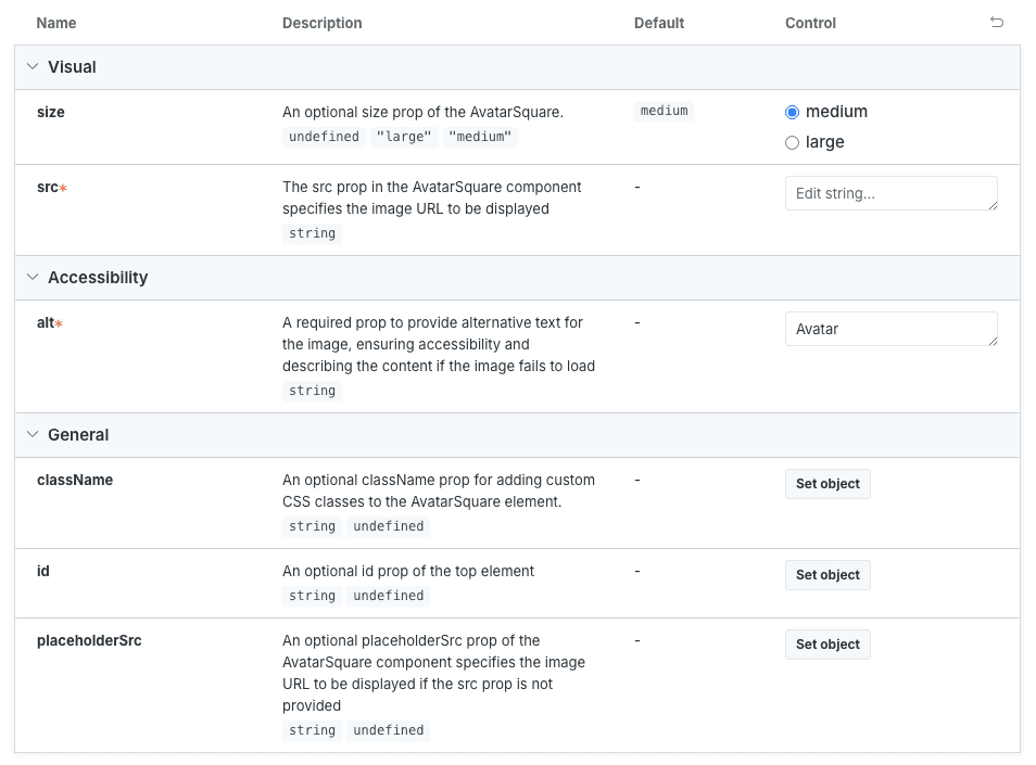
Mechanically, this removed ~800 lines of repetitive argTypes.x.table.category = … annotations from stories. More importantly, anyone (designer or developer) opening a component's docs finds the props grouped the way they think about them: "what does it look like" vs "what events does it fire" vs "what's the accessibility surface."
A live code sandbox for every component
A code sandbox inside the design-system docs is one of the highest-leverage things you can build for adoption — it makes it dramatically easier for product teams to actually try a component into their code. Instead of reading a static prop table, a product engineer can paste, edit, and see the result right inside Storybook.
On Storybook there are several ways to deliver this — existing add-ons, custom solutions, hybrids. The best choice depends on the tech stack and on the features the team actually needs. For Manychat we built it on top of the public storybook-addon-code-editor, with one upstream contribution back so tag filtering would work cleanly for our customised docs grid.

Every component now has an "interactive" story alongside its variants. A product engineer can land on Select, paste a real-shaped options list, and see immediately whether the component handles it — without leaving the docs.
Foundations designers and developers can read together
Tokens (colours, spacings, typography) used to sit on the page as visual swatches alone — pretty, but you had to ask in Slack which CSS variable produced them. We rewrote the foundation pages to surface, on the same row: the swatch, the design-token name, the CSS variable, the JavaScript variable name, and (for spacing) the utility class.
Before — colours were illustrated as a swatch grid with end values only. After — every colour now surfaces its design-token name and CSS / JavaScript variables alongside the swatch.
The same shift on the spacing page. Before, spacing was nicely illustrated but the way of using it was implicit. After, every spacing value shows its visual scale, the utility class to apply it, and the underlying value.
This change came directly out of a feedback loop with product engineers at the first in-house design-system community meeting. They'd been navigating tokens by guessing class names. The fix was a documentation re-shape, not a token change — but the effect was that designers and developers stopped speaking different languages about colour and spacing.
Adoption rollout — a repeatable pattern for V1 → V2
Three V1 components (Toggle, Radio, Checkbox) were already used everywhere in the product when we started. Replacing them in place would have been disruptive; leaving them alone meant fragmentation. We used a three-step pattern, applied identically to each:
- Build V2 next to V1. The new component lives in Storybook with a
Betatag (visible in the sidebar). Product can opt in. - Migrate consumers one product folder at a time. The DS team owns the migration commits.
- Promote V2 to the canonical name and delete V1. Only after the consumer count drops to zero. For Toggle, Radio, and Checkbox, this happened in April 2025.
The pattern is dull on purpose — predictability is the point. Product teams know what's next.
Over the engagement, Storybook moved 6.5 → 7.6 → 8.x, and the bundler swapped from CRA-based Webpack-5 to Vite. I led the Vite migration. Cold start dropped meaningfully; HMR became usable again. The customised Docs layout, sidebar tags, and props categoriser all rode alongside the upgrade — by the end, the Storybook is materially different from the one we inherited, in tooling and in surface.
A few components, up close
A handful from the catalogue — chosen for the visual range of the system, not as a complete inventory.
Form family — text, number, search, textarea
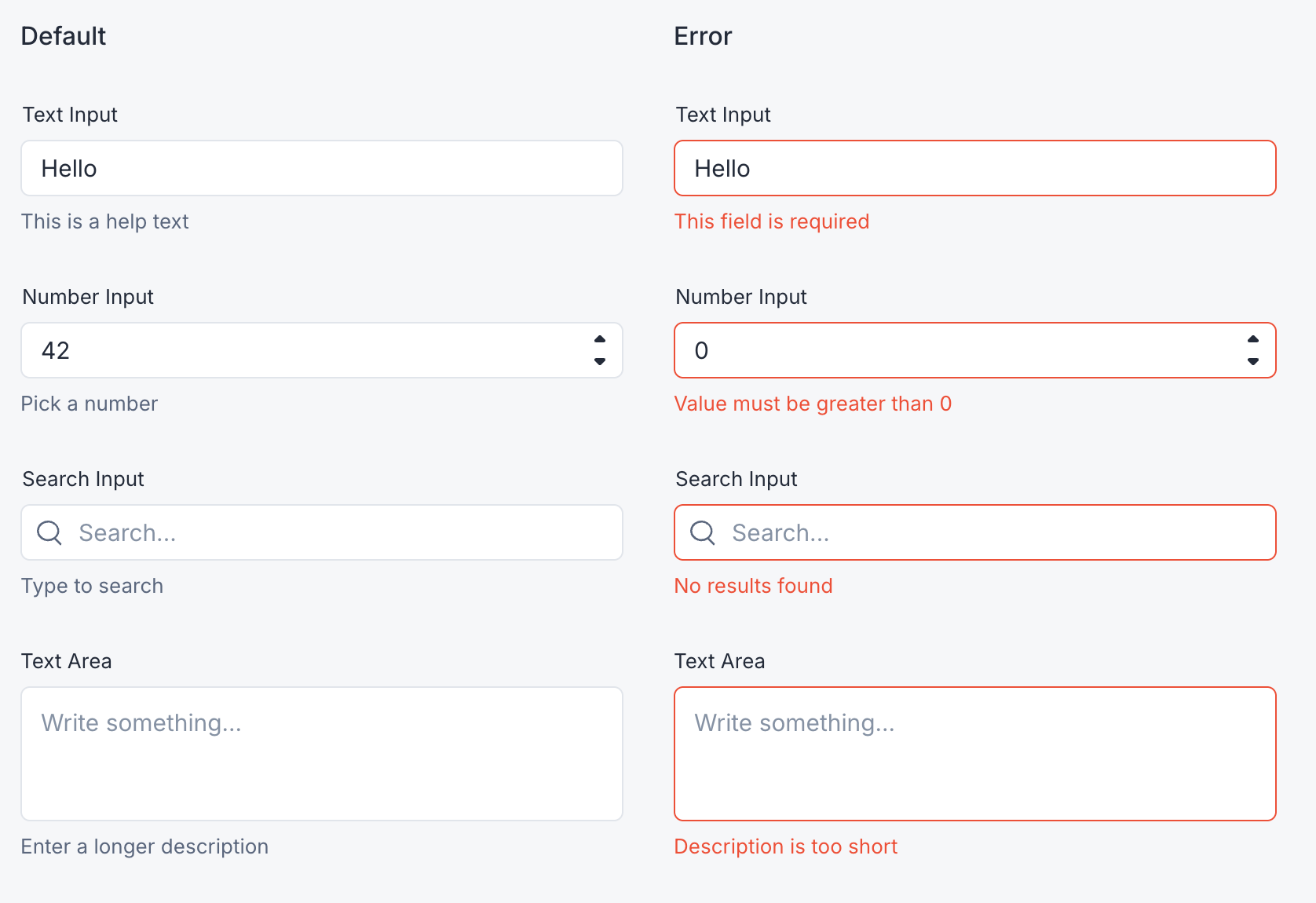
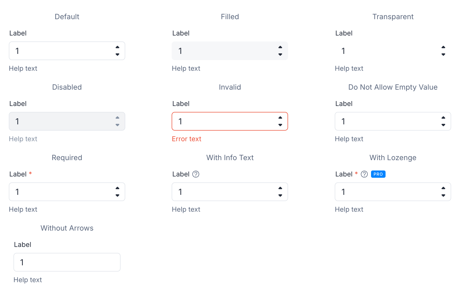
Four inputs, one shared layout. Label position, help-text spacing, and error message placement are owned by FormTextField, so the family stays consistent and a styling change ships in one place.
Select — the most flexible picker in the system
Select started life as a dropdown replacement for Autocomplete, but it ended up as the system's most flexible picker — anywhere a product team needs to choose one thing from a list, this is the component they reach for. The design intent: keep the anchor (the visible field) and the list (the popover content) loosely coupled, so the same component can be a plain dropdown in one place and a rich account picker in another, without forking the implementation.
Three uses cover most of how product teams reach for it. Search through long lists — toggle the search slot and a search field appears above the options; the list filters as the user types and arrow-key navigation keeps working without losing focus. Group related options — options can be flat or grouped, with labels at the group level and items inside; the component handles the visual hierarchy and skips over group labels in keyboard navigation, the consumer just shapes the data. Render whatever the design requires — two slots (renderOption and renderAnchor) let designers replace the default option row and the collapsed anchor with anything: avatars, lozenges, multi-line layouts, helper text. An account picker — avatars, names, and meta — is built entirely through renderOption.
Underneath all the surface variants is a single component that handles keyboard navigation (rove-focus through the options, Escape to close, Enter to select), scroll-into-view for the focused option, accessibility plumbing (the labelling rule from the form family applies here too), and the empty / loading states. By the end of the engagement, Select had replaced Autocomplete in most product code — same picker affordance everywhere, regardless of how rich the rendering is on top.
List — one primitive, two surfaces
List is shaped around a small, predictable slot vocabulary so its visual rhythm stays consistent everywhere it appears. Each ListItem exposes four areas: a left slot (24px, typically an icon or avatar), the main text or arbitrary children, an optional Lozenge anchored to the text, and a right slot (24px) for an action affordance or a secondary indicator. Two sizes (default, large) tune density; selected, focused, loading, and danger cover the common interaction states.
For information architecture, ListGroupHeading introduces a cluster of items and ListDivider separates clusters — both used inline with ListItem, so the list itself owns its hierarchy rather than asking consumers to wrap items in extra containers.
The design-system payoff is dual-use. The same primitive renders standalone product lists — wherever a screen needs a scannable column of items — and it's the popover content of Select. One component, two surfaces, identical visual language. So a settings list and a Select dropdown look "right" in the same way: the system has one mental model for "a list of things you can act on", not two.
Lozenge — a closed semantic vocabulary
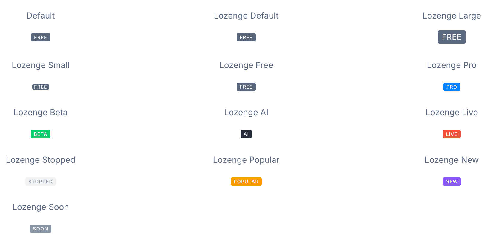
Lozenge is intentionally a closed component. There's no text or children prop — consumers pick from a fixed vocabulary of nine types: plan tiers (free, pro), capability indicators (beta, ai), status states (live, stopped, soon), and social-proof tags (popular, new). Each type has a fixed label and a fixed colour. If the product needs a new badge category, the system gets extended; product code can't invent one. That constraint is the design — it's how the visual language stays tight at scale.
Three sizes (small, medium, large) handle the density difference between a status pill on a list row and a feature flag in a section heading.
A small accessibility detail worth pointing out: the visible glyph is hidden from screen readers, and a longer descriptive sentence is read aloud in its place. The PRO chip just shows "PRO" on screen; a screen-reader user hears "Pro indicator: a premium offering that requires a paid subscription." Two audiences, two appropriate amounts of context, one component.
I introduced this component in 2024 (originally as Badge); the in-house team grew it into the broader semantic system you see today.
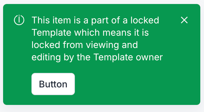
SectionMessage

A page- or section-level message component covering info, warning, error, and success. I owned the full cycle: spec through implementation, then migrating product code off the older SystemMessage in the same release window.
Modal and Toast — overlay surfaces
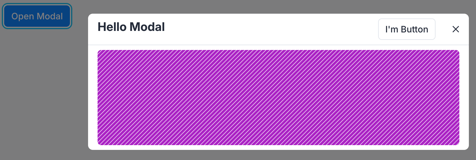
Both components live above the main canvas and have to behave well as transient surfaces. The Modal got a redesigned close-button affordance that I led, rolled out across ~10 consumer modals in the same commit window so the visual update landed everywhere at once. The Toast is a feedback overlay with timed dismissal, an isTemporary flag, and inner-button accessibility via React Context — so an action button inside a Toast can dismiss its parent without prop drilling.
Open-source contribution: storybook-addon-code-editor
The live code sandbox in Manychat's Storybook needed support for excluding sandbox stories from the docs grid. The public storybook-addon-code-editor didn't support tag filtering. Rather than ship a workaround inside Manychat's Storybook config, I extended the public addon with tag support and contributed it back. After the upstream change landed, I removed the local workaround in Manychat. The team's codebase got smaller; the Storybook community got a more flexible addon.
My contribution
Bridge the Gap brought three engineers to the engagement, including me, and I led our side of the work. My contribution sits in four layers.
Architectural direction. I owned the technical-direction calls across the system: how the form family composes, how accessibility is enforced through the type system, how Storybook is upgraded and customised, how documentation is generated, how component lifecycles are surfaced in the sidebar, how foundations are presented to designers and developers together, and how new components actually arrive in product code. The spec-driven definition method is mine, and it ran on every component the team shipped.
Practice and coaching. With Manychat's design-system tech lead, the relationship was a senior-engineer partnership with an occasional coaching dimension — they held architectural authority on the Manychat side; I brought patterns I'd seen work on prior DS engagements (component governance, contribution flow, communication, lifecycle conventions), and they brought the product, organisational, and customer context that made those patterns fit. Across the wider design-system community at Manychat, I brought design-system-as-a-discipline practice into the meetups, the contribution flow, and the documentation conventions; the in-house team translated each pattern into something that worked for the org's actual structure. Both directions of exchange were load-bearing.
Leading my team. On the Bridge the Gap side I led three engineers — running our planning and pairings, coordinating with the in-house team, holding the line on quality and cadence, and making sure our work integrated cleanly with theirs day-to-day.
Hands-on. What I personally built or rebuilt:
- Foundation cleanup. Consolidated
manyuifrom per-component sub-packages into one publishable package. Cleared a layer of build complexity that every later tooling decision benefited from. - Form scaffolding. Designed and implemented
FormTextFieldas the shared layout for all text-style inputs. Re-applied it after a tech-lead push-back, instrumented with the diagnostic tests that surfaced the original concerns. - The customised Docs grid layout in Storybook.
- Status tags in the Storybook sidebar. Custom sidebar renderer with a fallback strategy for the Storybook 7 transition.
- Auto-categoriser for props. Replaced ~800 lines of manual annotations with rule-based classification.
- Foundations rewrite for colours and spacings — the swatch-plus-CSS-variable-plus-utility-class layout.
- Storybook → Vite migration. Single-author migration; the team gained back a meaningful slice of dev-loop time.
- Story-file decomposition for visual regression. The architecture Chromatic-style tooling sits on.
- Live code sandbox + the upstream addon contribution.
- SectionMessage — full cycle from spec through implementation, adoption migration, and follow-up polish.
- Modal close button redesign — including same-commit rollout to ~10 consumer modals.
The shape of my contributions is foundational rather than feature-by-feature: the things every other component leverages, plus the cross-cutting fixes nobody else wants to debug.
Outcomes
- 25+ new components added to
manyui, with the form family unified under shared scaffolding. - ~1,500 product file-touches by the design-system team. Adoption was not a wishlist; it shipped alongside each component.
- Three Storybook majors and a bundler swap completed without freezing component work — and with a materially better Storybook surface for designers and product engineers.
- Accessibility enforced at compile time for every form input, removing a class of review-time issue.
- Foundations rewritten so every token surfaces its swatch, design-token name, CSS variable, JS variable, and utility class together — discovered through a feedback loop at the in-house DS community meetup.
- One open-source upstream contribution to
storybook-addon-code-editor.
By mid-2025, product teams default to manyui rather than reaching for raw HTML or copying patterns. The DS is now a yes, and — a thing that helps engineers ship — rather than a yes, but.
Lessons
Owning adoption keeps the system honest. Every time we migrated a component into the product, we learned something the spec missed. Owning that work made our specs sharper over time.
Documentation is design work. The biggest perceived shift in the engagement wasn't a new component — it was rewriting tokens to show CSS variables and utility classes alongside swatches. The same information, surfaced where designers and developers were already looking.
Type-system enforcement beats lint rules. Accessibility declared in the type system breaks the build; accessibility behind a lint rule eventually gets // eslint-disable'd. Pick the layer that's hardest to bypass when the cost of bypassing is invisible.
Specs are written for designers and tech leads, not developers. A spec is a conversation tool. The test plan in plain English is what makes the conversation real. The implementation almost writes itself once the conversation is done.
Visible status beats governance documents. Lifecycle stages shown in the Storybook sidebar mean anyone scanning components knows where things stand. No registry to consult. No drift.
Further reading
I wrote a public account of this engagement for Manychat's engineering blog: Building Better Together — The Revamp of Manychat's Design System. It's the partner-facing version of the same story — the visible outcomes, the working method, and the community angle — written for an audience of fellow engineers and design-system practitioners.
Happy to go further than this page. The screens, the trade-offs, and how the work landed in the product are easier to show in a private conversation — get in touch if you'd like that.