Me

Varya Stepanova
Expert in Design Systems
Frontend enginner, service designer
Contacts
Areas of expertise
Design systems: production and governance,
pattern libraries, style guides, UI/UX, front end.
Design system at Elisa
- Library of CSS components
- Libraries of React components
- UI kit in Sketch
- Shared tools and practices
- Great design community
- World-class front-end teams
What is design systems?
Design Systems
- shared practices
- tools
- processes
- community
See more in the relevant article: What is a design system? And why it is more than just a library or a style guide.
To react or not to react?
Living style guides


Only for React libraries or..?
How to document?
brand-button.scss
// Brand button
//
// markup:
// <button
//   class="brand-button">
//     Click here!
// </button>
BrandButton.md
# Brand button
```
<button
  className="brand-button">
    Click here!
</button>
```
How to document?
brand-button.scss
// Brand button
//
// markup:
// <button
//   class="brand-button">
//     Click here!
// </button>
BrandButton.md
# Brand button
```
<button
  className="brand-button">
    Click here!
</button>
```
React for non-React
- Parse code snippets
- Reactify
<button class="myButton"> <button className="myButton" /> - Create stories
- Automate
Designers update libs
Designers updating their design libraries 🥵 https://t.co/ojFRhj8Smo
— Alex 🌚 (@alexmuench) March 28, 2019
React = friendly environment and tools
- Development playground
- Autogenerated docs
- Plugins
This is CSS

Visual regression tests
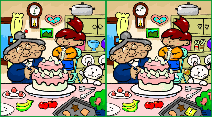
Visual regression tests
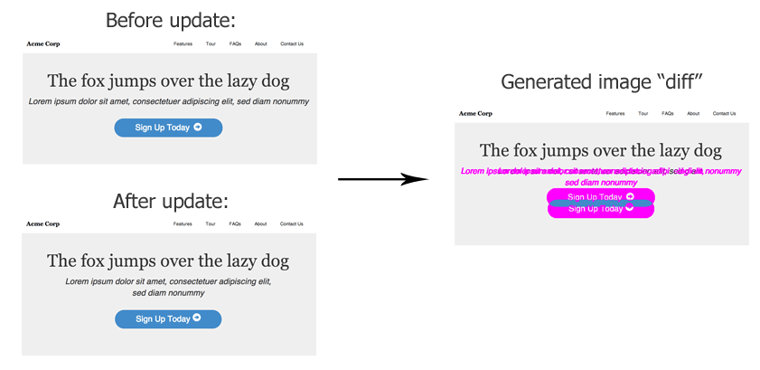
with Styleguidist or Storybook
Get visual tests with one npm install
Style Guide vs Design System
Design systems - connecting people

Design systems
Connecting People
Single point of truth
What is it for me?
- Release notes
- Documentation
- Tone of voice
- Design specs
- Strategy
- Roadmap
- Money spent
- Money saved
See more in the relevant article: What is a design system? And why it is more than just a library or a style guide.
Design system website
- patterns
- visual language
- processes
- community
- design tokens
- notes
- design principles
- documentation
- guidelines
- naming conventions
- brand
- vocabulary
- changelog
How Gatsby works
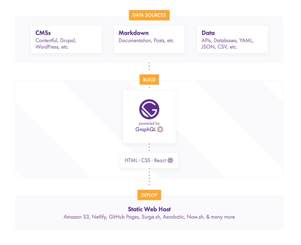
Credits: Robert Ngo, Decoupling Drupal with Gatsby
Design system website
example of structure
content/
  pages/
    docs/
    about/
      team/index.md
      workflow/index.md
      index.md
  posts/
    welcome-to-new-ds-website/
      index.md
      thumb.png
- Home
- Docs
- Style Guide
- Blog
- About
Use your superpowers
React components in texts
components/BodyText.js
const renderAst = new rehypeReact({
  createElement: React.createElement,
  components: {
    'comp-my-button': MyButton,
  },
}).Compiler;
pages/my-page/index.md
title: Title of your page
---
Page text and living
<comp-my-button></comp-my-button>.
React components in texts, v2
gatsby-config.js
resolve: `gatsby-mdx`,
options: {
  globalScope: `
    import { MyBrandButton }
      from "./button.js";
    export default { MyBrandButton };
  `
	}
button.mdx
# Documentation for button

Look Ma, here is my button!

<MyBrandButton />

Inside some custom text docs :-)
Custom React components
- Interactive schemas
- Adjustable docs
- Cartoons
-
EntertainersProblem solvers
Interactive changelog?
Get plain data from GitHub
and represent it with a friendly interface!
One single point of truth
Extract info from packages and repos
Make your design system website a place where all the info can be found at any time.
Display markdown from libraries, tools and related repositories on the website pages.
Do more together
Welcome to contribute
Input
<input placeholder="Placeholder Text"
    class="input" type="text" value="" />
Text inputs are accompanied by a label and wrapped inside a fieldset. The :hover and :focus styles follow our brand colors.
Reward the contributors
Input
25.04.2019 · Contributors
<input placeholder="Placeholder Text"
    class="input" type="text" value="" />
Text inputs are accompanied by a label and wrapped inside a fieldset. The :hover and :focus styles follow our brand colors.
Share information
Most design problems are really people problems.
— zeldman (@zeldman) 1. huhtikuuta 2019
Blogging
- Announcements
- Plans and strategies
- Involving the community
- Everyone takes stage
Cherish in-house blogging




Give familiar interface
People are not used to writing markdown and edit files on GitHub? Offer them Wordpress as a source for your design system website blog.
Show meta data
What is our design system
Get the data
- Crawl repositories
- Inject scripts on production
- Grab data from task managers
Show the data
- Numbers
- Links
- Charts
Design systems as a service
Thank you

A Practical Guide TO BUILDING YOUR Design System Infrastructure
Slides: varya.me/patterns-day-2019
by Varya Stepanova
Credits
This pressentation used icons made by Freepik and Eucalyp from www.flaticon.com. They are licensed by CC 3.0 BY.

